The Anatomy of a Great Digital Menu

If you're ready to dive into the captivating world of digital menus, you're in for a treat. In this digital age, where every pixel matters, let's explore the intricate components that make up a stellar digital menu – one that not only showcases your offerings but also leaves a lasting impression on your customers. Get ready to uncover the secrets behind a remarkable digital menu that wows, informs, and guides patrons on a delightful journey through your curated offerings.
Large Title: Setting the Stage for Exploration

Picture this: you're about to embark on an adventure through a lush landscape of cannabis options. But wait, where do you start? Titles on your menu act like signposts, directing your customers toward the enchanting paths of exploration that await them. In the realm of strains, the possibilities are as diverse as the stars in the night sky. Take, for instance, the charismatic strain Jean Guy. This extraordinary strain unfolds its allure in a variety of forms, from Pre Rolls to Flower, Kief, and even 510 Cartridges. Now, with the magic of large, easy-to-read titles, you can easily guide your customers toward the precise Jean Guy product that aligns with their desires.
Product Names: Embrace Simplicity

Much like a meticulously arranged desk, BudSense menus exude an elegance where every detail has its rightful place. Following this principle, your Product Names can embrace simplicity. There's no need to inundate them with producer names, sizes, or any superfluous details. These particulars all have their dedicated spots on your menu. Provide these names the room to shine unobstructed! Eliminate any additions that might hinder customers from effortlessly perusing your menu.
Contrast: Colors that Speak Volumes
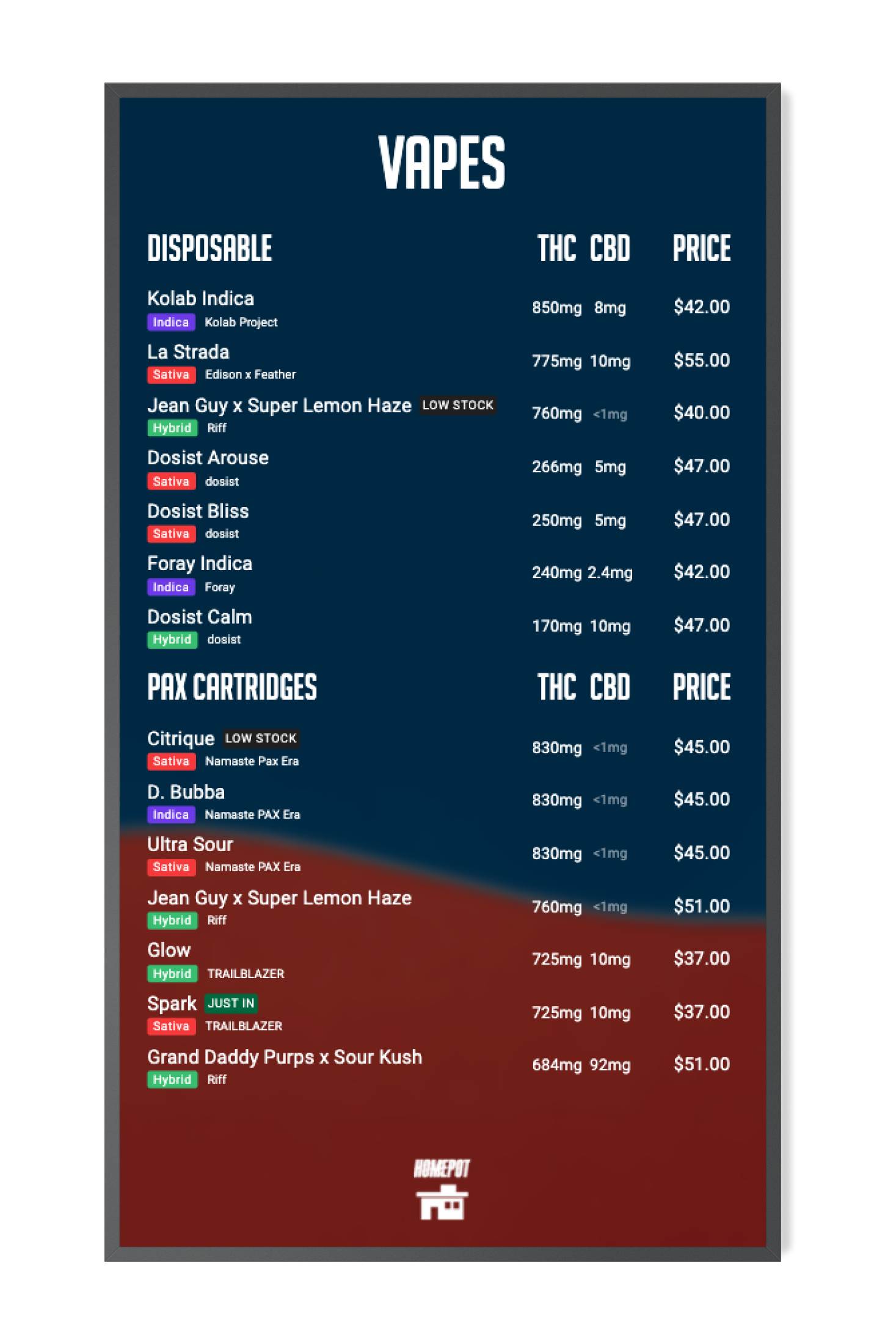
When crafting your menu, give a good old nod to contrast. That's the secret sauce – the perfect balance between your menu items and the background. Why? Because low contrast isn't just dull, it's like sending your customers on a treasure hunt with a blindfold. And honestly, who needs that? Strive for optimal contrast, where words dance off the menu like they're at a party, and your customers can read without feeling like they're deciphering some ancient riddle. Your theme colors? Well, they're the life of this colorful party! So, whether you're a master of light or a commander of dark, remember: a dash of contrast keeps the reading woes at bay and keeps the fun going strong.
Clear Cannabinoids: Revealing the Magic
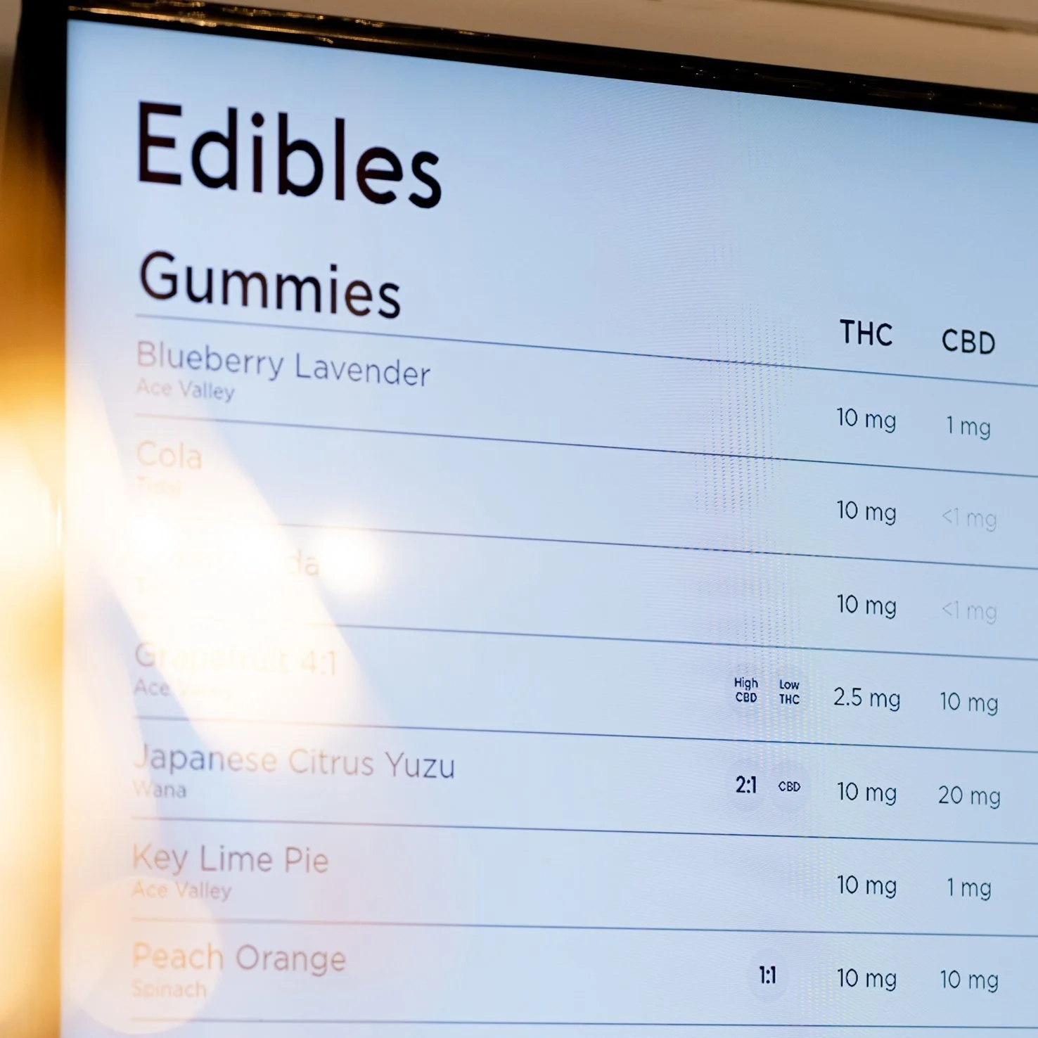
Every cannabis product has uniqueness – especially when it comes to cannabinoids. Don't keep these crucial details hidden. Instead, present them in a clear row, like a display of rare jewels in a museum. This allows customers to quickly compare and contrast products, helping them make informed choices as they embark on their cannabis journey.
Badges and Labels: Guiding Lights

Imagine strolling through a bustling marketplace, and certain items catch your eye with bright labels and badges. In the digital realm, these badges and labels are secret weapons. They guide your customers' eyes to special items, drawing attention to the gems of your curated menu. It's like having a knowledgeable guide pointing out the must-see attractions in a new city. With these visual cues, customers can swiftly locate the products that resonate with their desires.
Legible Font Size: A Feast for the Eyes
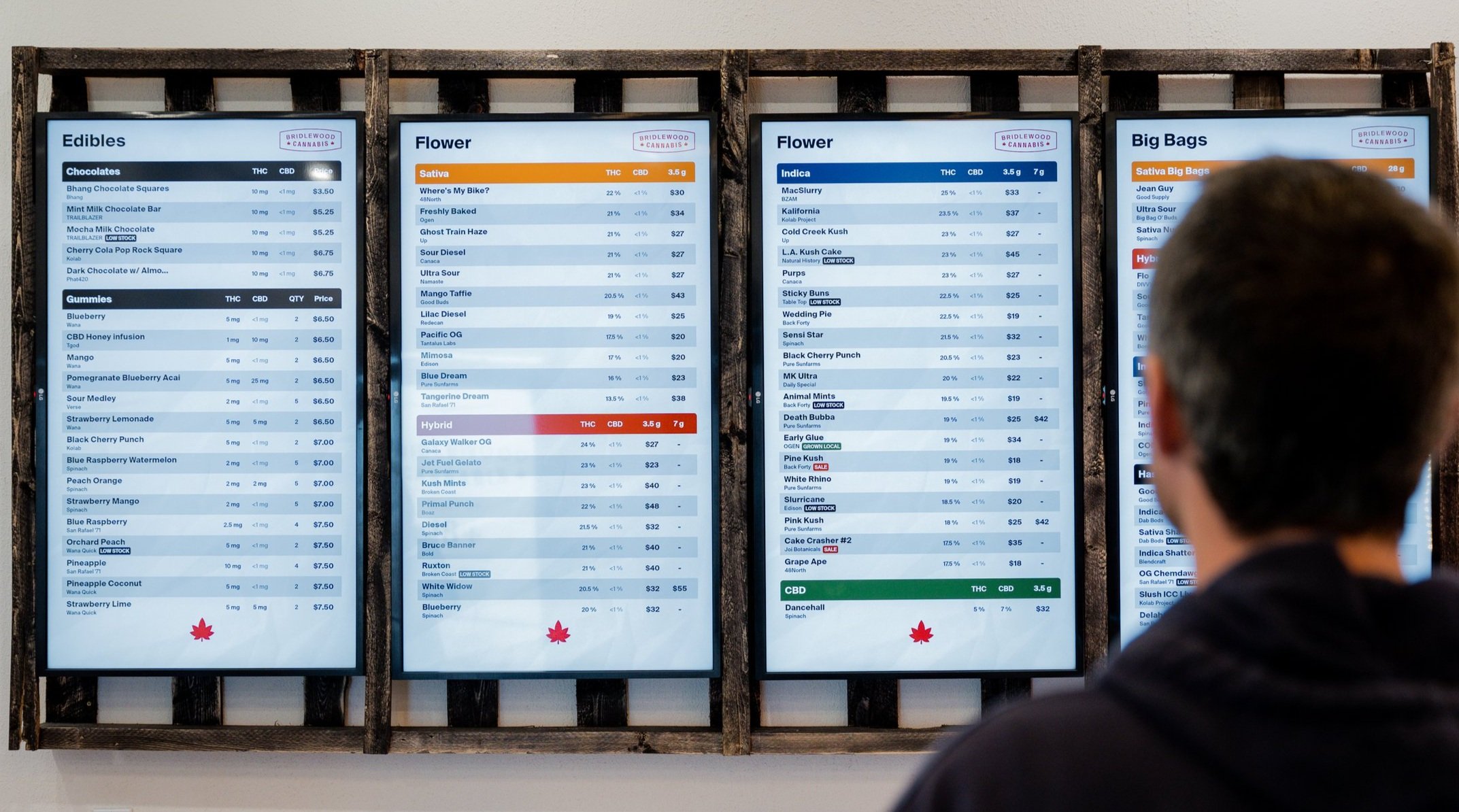
What's the point of offering a plethora of amazing products if customers can't read them? Here's where legible font sizes come to the rescue. Just as a well-written novel captivates readers, legible font sizes invite customers to dive into your product offerings. No squinting or zooming required – just clear, comfortably sized text that enhances the overall experience.
Consistent Spacing: A Symphony of Order

Consistency is the unsung hero of user experience. Just as a symphony's harmonious arrangement soothes the soul, consistent spacing in your digital menu offers a seamless and enjoyable browsing experience. When items are thoughtfully spaced, customers can explore with ease, like dancers gliding effortlessly across a well-laid dance floor.
Brand Recognition: A Dash of Familiarity

Your branding efforts have been a labor of love, so why not let them shine? The logo, the palette, the vibe – let your menus echo your brand's essence. Integrating your branding into your digital menus is like a warm hug from your dispensary's identity. It's a visual nod, a digital wink that whispers, "Welcome back!" This subtle gesture forms a bond between your patrons and your dispensary, amplifying their journey and making it unforgettable.
Impactful Digital Menus
In the realm of digital menus, BudSense is the wizard's wand that weaves these enchanting elements together, creating an experience that's as magical as the products themselves. As you embark on the creation of your own exceptional digital menu, remember that every detail, from the large titles to the clear cannabinoids, plays a vital role in crafting a narrative that captivates and delights your customers. So, seize the opportunity, infuse your brand's identity, and embark on a digital adventure that takes your customers on a journey they'll never forget. Happy menu crafting!
How do I learn more about BudSense?
Great Question! Book a demo today to learn more about how BudSense can enhance your cannabis dispensary!