3 Ways Dispensary Menus Build Bigger Basket Sizes
Sell more weed and build bigger basket sizes 🛍️
For cannabis retailers, one of the most important factors for success is basket size. The bigger the basket size, the more money your dispensary makes! To maximize your basket size, you can use strategic menu design to draw customers in and get them to buy more products. Let’s explore how menu design can help you increase cannabis sales and grow your bottom line.
The Power of Color & Design
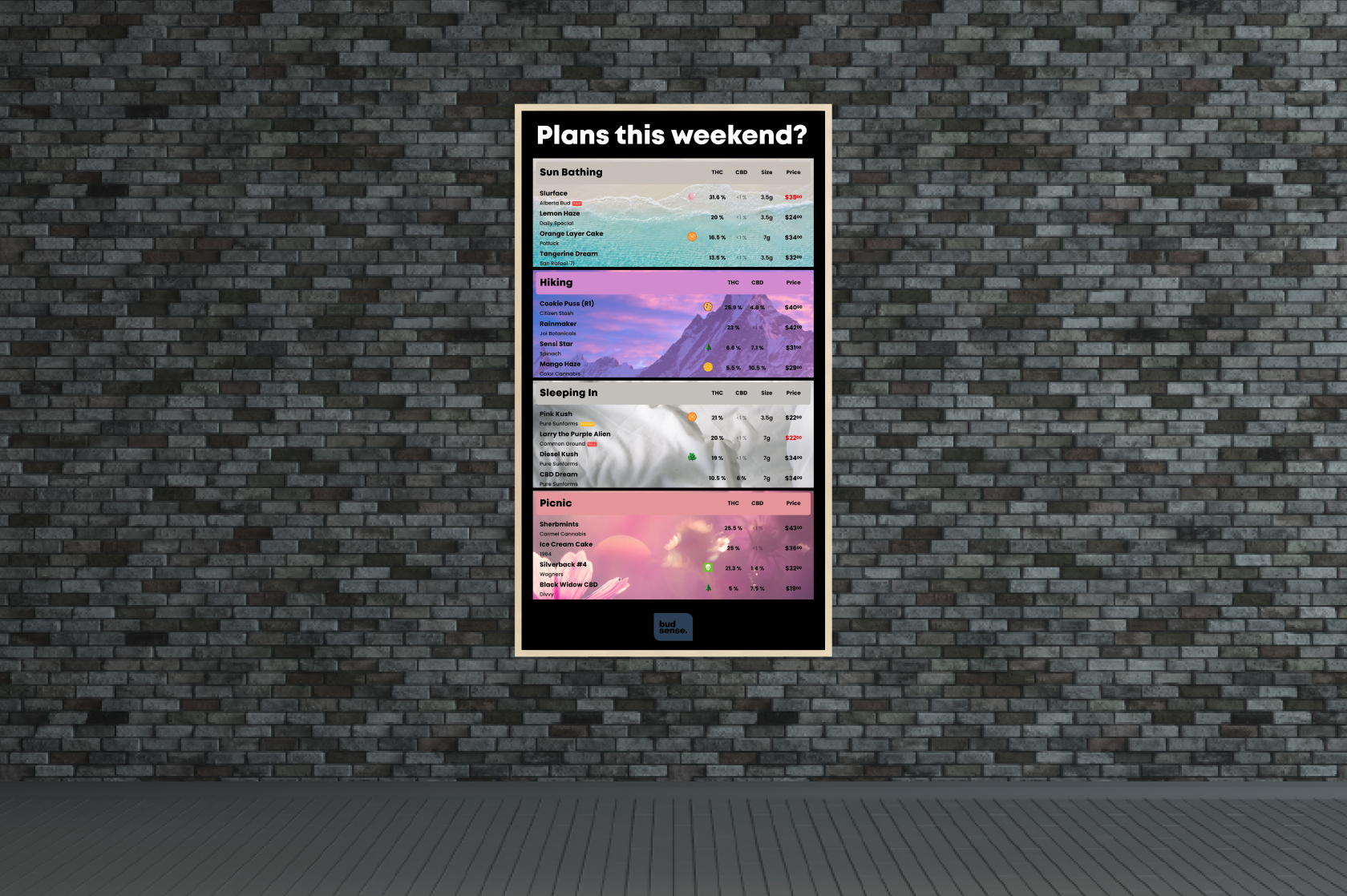
When it comes to menu design, there are a few things you should keep in mind. First, consider the color palette and overall aesthetic of your dispensary menus. Use colors that will draw people in and create an inviting atmosphere in your dispensary. Additionally, make sure that the font and text sizes are easy to read – no one wants to squint or strain their eyes when trying to read a menu! Keep the design simple yet eye-catching so that customers will be drawn in.
2. Organization & Categorization
Organization is key when it comes to designing cannabis menus. Customers don’t want to have a hard time finding what they’re looking for – they want everything laid out clearly and logically. That means categorizing products into different sections based on type (e.g., flower, edibles) or effects (e.g., energizing, calming). This way customers can quickly find what they need without having to search through hundreds of cannabis products at once!
3. Product Descriptions & Photos
Another great way to draw customers in is by using product descriptions and photos on your cannabis menus. Descriptions help customers understand what each product does and why it might be right for them, while photos give them a visual representation of what they can expect from that product. When done right, these elements can grab a customer’s attention and encourage them to purchase more products than they originally planned on buying!
To recap, menu design is an essential part of maximizing basket size in any cannabis dispensary. By utilizing strategic color palettes and organizing products into categories with product descriptions and photos, you can easily draw customers in and encourage them to purchase more items than they originally planned on buying. With thoughtful menu design, you can increase sales and grow your bottom line!
How Ingram and Sons Builds Bigger Baskets
We spoke with Brad Ingram from Ingram and Sons to see how using BudSense was impacting his dispensary. Here’s what we learned.
“People are loving the print menus, we actually have to back out of a lot of transactions because people don’t put down the menu, instead you’ll hear “Omg, you have this too?! I’ll get one of those also!”
We are so happy to hear when our customers share with us how BudSense makes selling weed easy for them. It’s feedback like this that fuels us to continue building our software to help cannabis retailers manage their dispensary menus with ease and sell more weed.
For more ways to build basket sizes, contact us any time as we’d be happy to brainstorm ideas with you.


