Make Your Edible Dispensary Menu Pop!
BudSense makes selling weed easy.
Here is your chance to get inspired, try new things, be creative, and build better dispensary menus using BudSense. We can’t wait to see how this Gummies and Chocolate digital menu inspires you to build a menu your customers will LOVE!
There has got to be a better way to merchandise your edibles
When was the last time you’ve walked into a dispensary and your mouth watered over the edibles offered? Us either.
But why? Maybe it’s the stale packaging, maybe it’s the inability to touch the product through the display glass. Whatever it is - customers aren’t connecting to the product!
But how can you connect your customers to the product?
Dispensary Digital Menus Boards for Edibles
Communicate to your customers what it’s like diving into the package 🤤🍭🍬🧁🍫
BudSense believes your edible dispensary menus should be delightful and appetizing! Your menu should visually educate and inform customers on what’s available so they can select the products that best suit their taste buds.
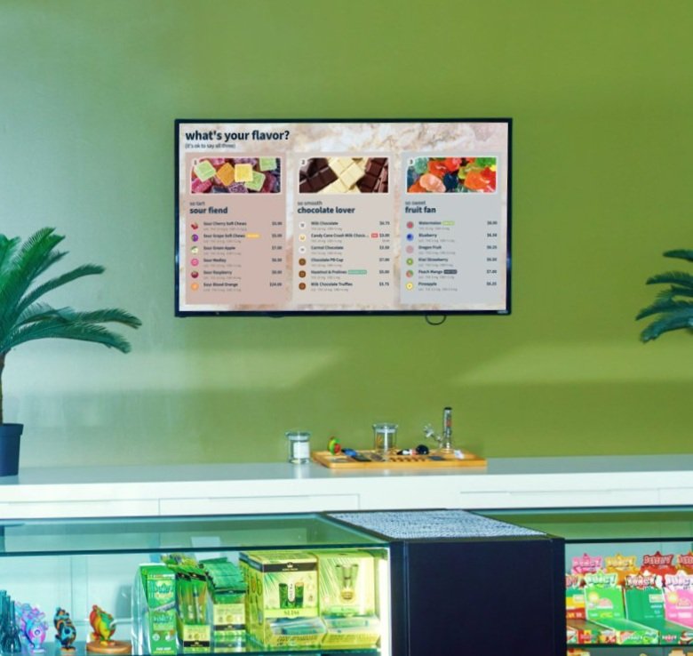
Here is an example of a category menu theme, available in the BudSense app, that was customized specifically with the edibles customer in mind.
For this digital menu design, we used three different methods to explain and communicate the difference between the types of products- Images, Titles, and Labels & Badges.
1) The Images
Those yummy-looking sour & fruity gummies and chocolates featured in the Image Cards really do get your taste buds bumpin’. Whether you’re trying to attract the chocoholic or the tarty sour and fruit fan gummie lover, the use of images can draw in those customers with sugar cravings.
Look at it this way. It is a lot more challenging to say “No” to chocolate when there’s a creamy chunk of chocolate right in front of you as opposed to reading the word “chocolate” on a list. Use your digital menus as an opportunity to leverage the power of using visuals.
2) The Section Titles
The use of adjectives to describe the flavour categories in the custom titles can connect to the customer’s taste pallet. The customer can develop a greater understanding of the different products when reading terms such as “tart”, “smooth”, and “sweet”, as opposed to guessing what they might taste like. Edibles are made from common candies we’ve all tried, so the use of recognizable description titles can help support and influence the customers purchasing decision.
3) Labels and Badges
The use of labels, and badges can guide your customer into selecting their flavour and type of edible. For example, in the sour fiend menu design, the customer can be enticed or drawn towards the Sour Medley gummie if they love sugar-coated sour gummies. The use of badges, such as this one may act as a decision-making shortcut.
The use of labels can also result in decision-making shortcuts. As seen in the chocolate lover menu design, a customer can see that the Candy Cane Crush Milk Chocolate is on sale. This will catch the attention of the price-conscious customer who wants to save a few dollars.
Help your customers satisfy their sweet tooth 🍬🍫🦷
The use of images, titles, and badges & labels are just three examples of ways in which you can get creative and use BudSense to help merchandise your edibles in a visually appealing way.
Life is like a menu of chocolates. You never know what you're gonna get. 🍫
As Forest Gump said, “Life is like a menu of chocolates. You never know what you're gonna get.” 🍫 …or something like that. We want your customers to get a better understanding of what’s inside the packaging, what’s available in your dispensary, and feel delighted about making their purchase. We want to make selling weed easy and fun for you so you can sell more weed.
We hope you enjoyed your Edible dispensary menu design and ask that you stay tuned for more entries in the Inspiration blog series.
If you’re looking for help with taking your menus from good to great contact us any time. We are happy to brainstorm ideas with you. If you’re curious about pricing, check it out on our pricing page.


