9 Menu Design Hacks Dispensaries Can Use to Make Customers Buy More Weed
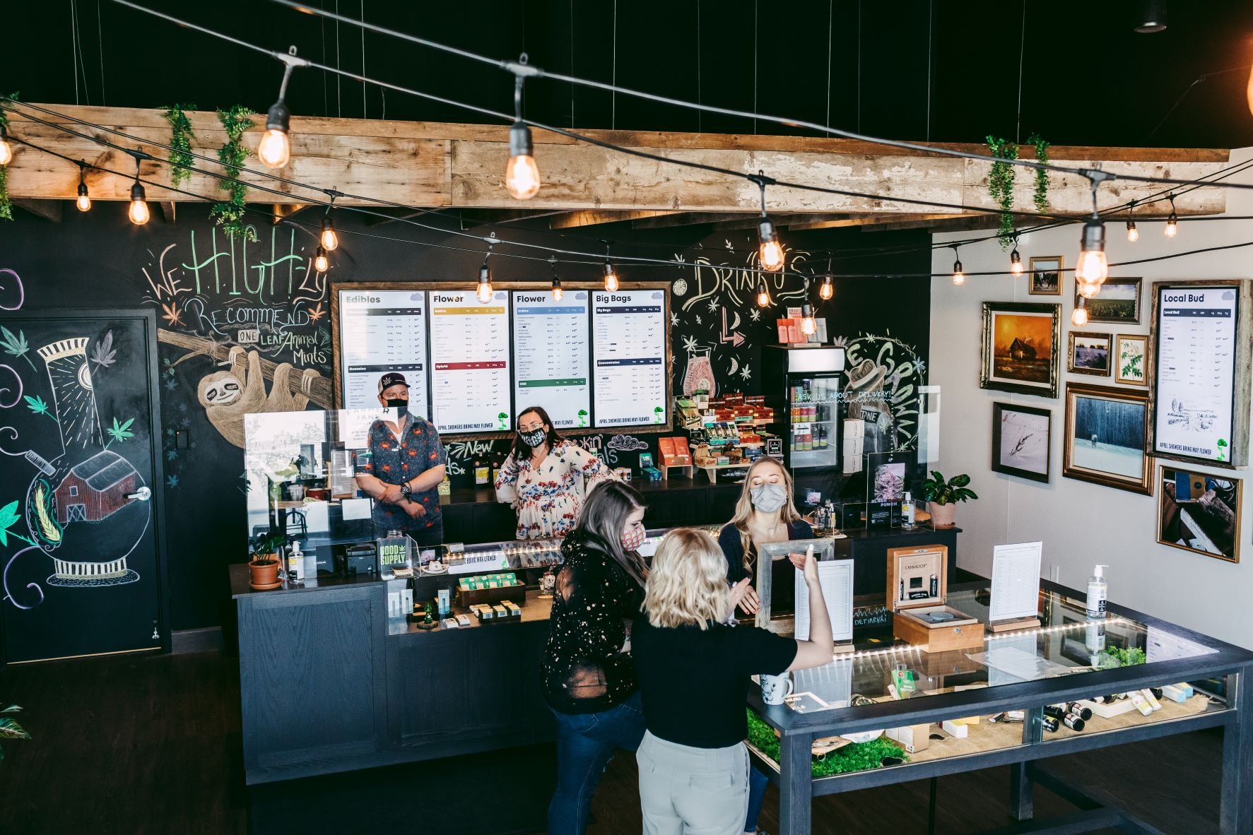
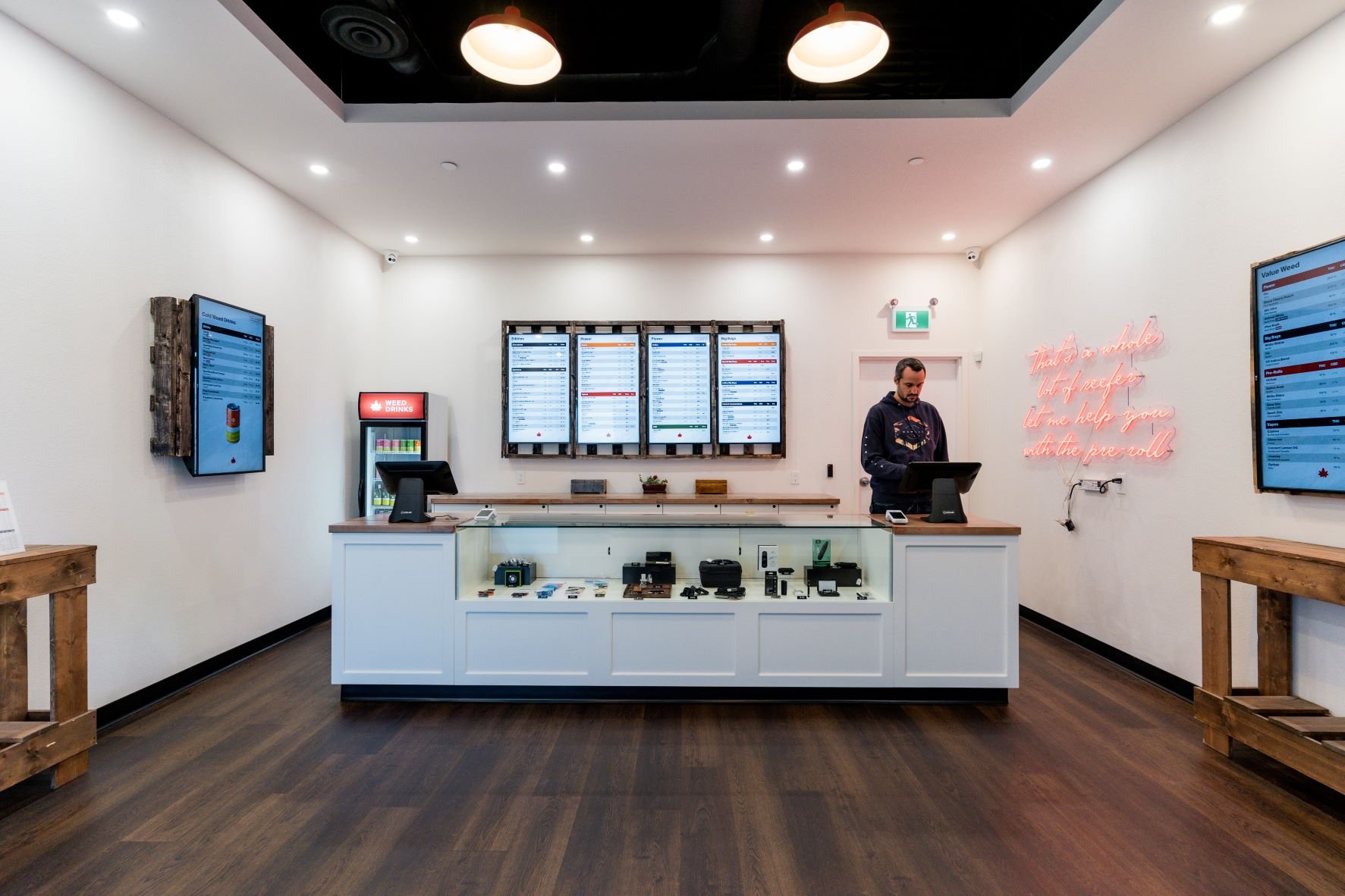
You’ve decided to open a Cannabis store. You’ve got a location, a brand vision, and a POS provider, now its time to design your menus!
Merchandising and psychology go hand in hand when influencing your cannabis customers’ thoughts and actions.
This means the design of your dispensary menus has the ability to guide and persuade your cannabis customers to buy certain products.
Call it what you will—subliminal messaging, the power of suggestion, consumer manipulation—but as a cannabis retailer, you are constantly looking for opportunities to support and impact your cannabis customer’s decision-making.
As your weed-selling companion, we thought we’d provide some ways in which you can design your menus to influence your customer psychology to support their purchasing decisions. Below are 9 design techniques, tips and examples which we believe will make selling weed easy, so you can maximize your cannabis dispensaries’ profits.
1. Make a great first impression with your cannabis customers
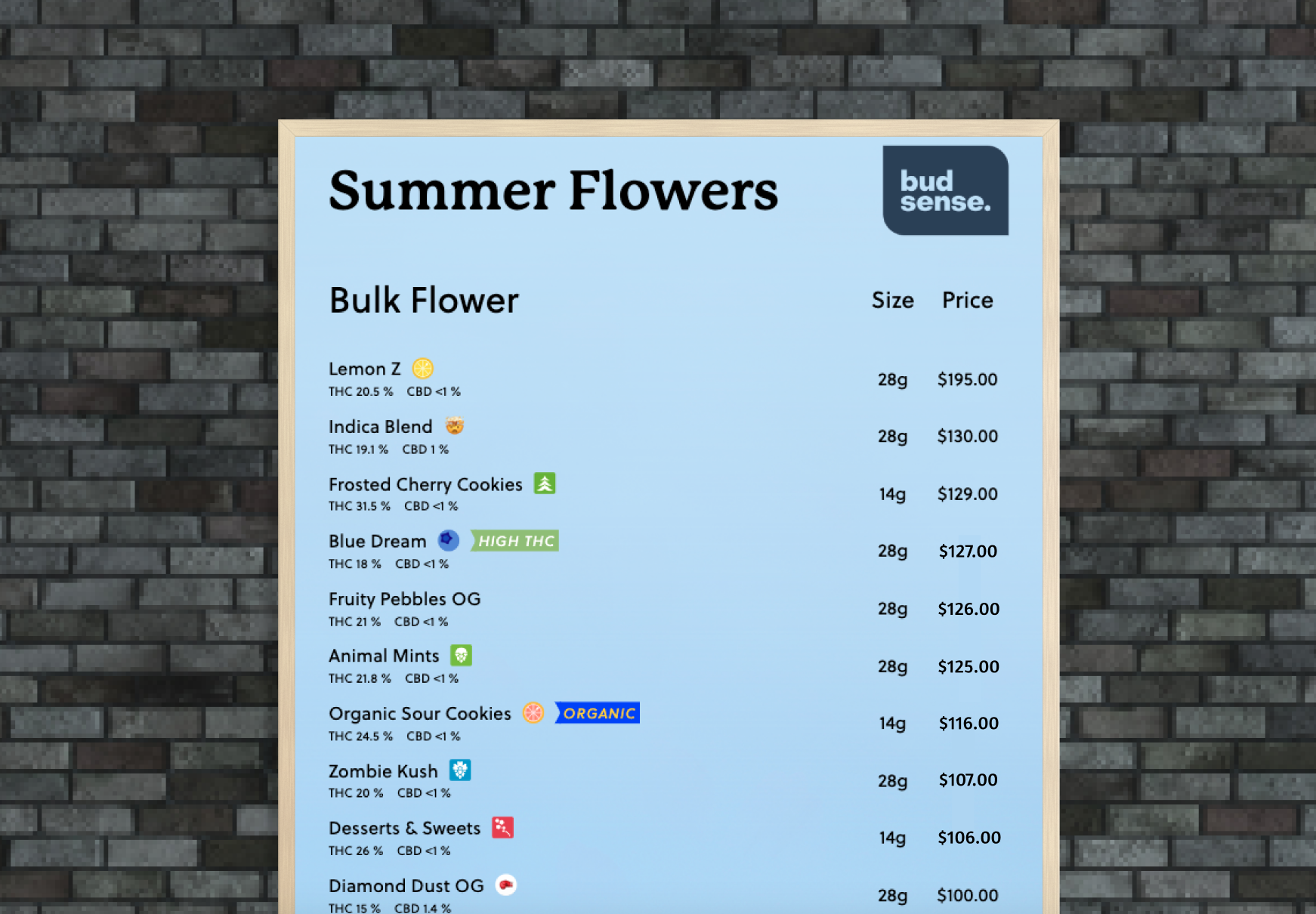
Rather than reading dispensary menus word for word, from top to bottom, cannabis customers tend to scan the products quickly. This means that a dispensary menu has a small amount of time to make a large impact. As a cannabis retailer, you can create dispensary menus that are easy to absorb by using clear menu titles, easy-to-find section titles, and other visual techniques such as margin size, column width and the number of columns.
Plan the layout of your menu to maximize its benefits. You can also start with a theme like the Amsterdam theme portrait menu.
2. Analyze cannabis customers reading patterns
When cannabis customers scan a dispensary menu, their eyes tend to gravitate first toward the upper left-hand corner of a menu, similar to reading a book. This spot is known as the cannabis menu’s “sweet spot” or the “prime real estate” on the menu. This means you’ll want to place the cannabis product you want to sell the most of in that “sweet spot”.
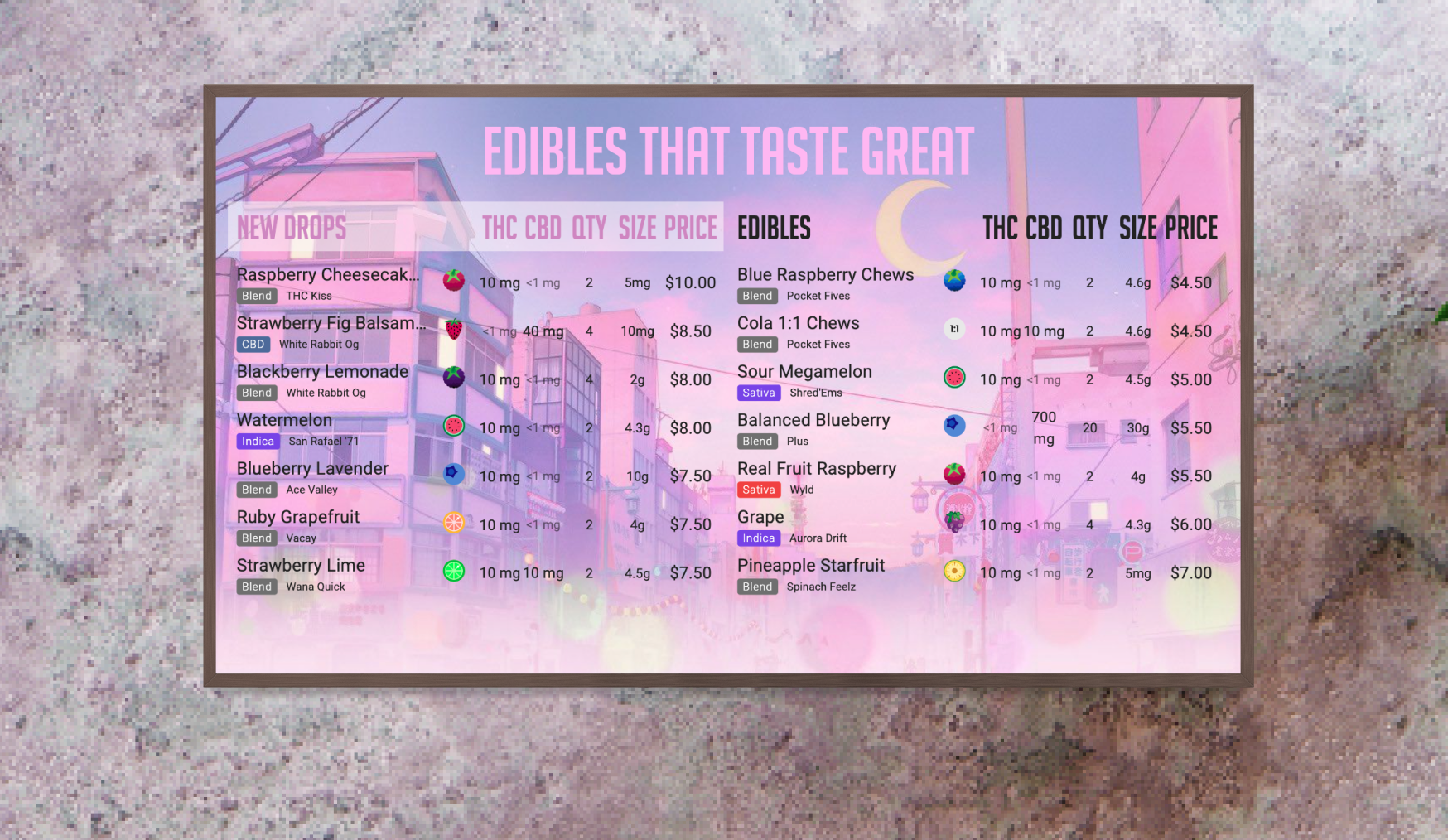
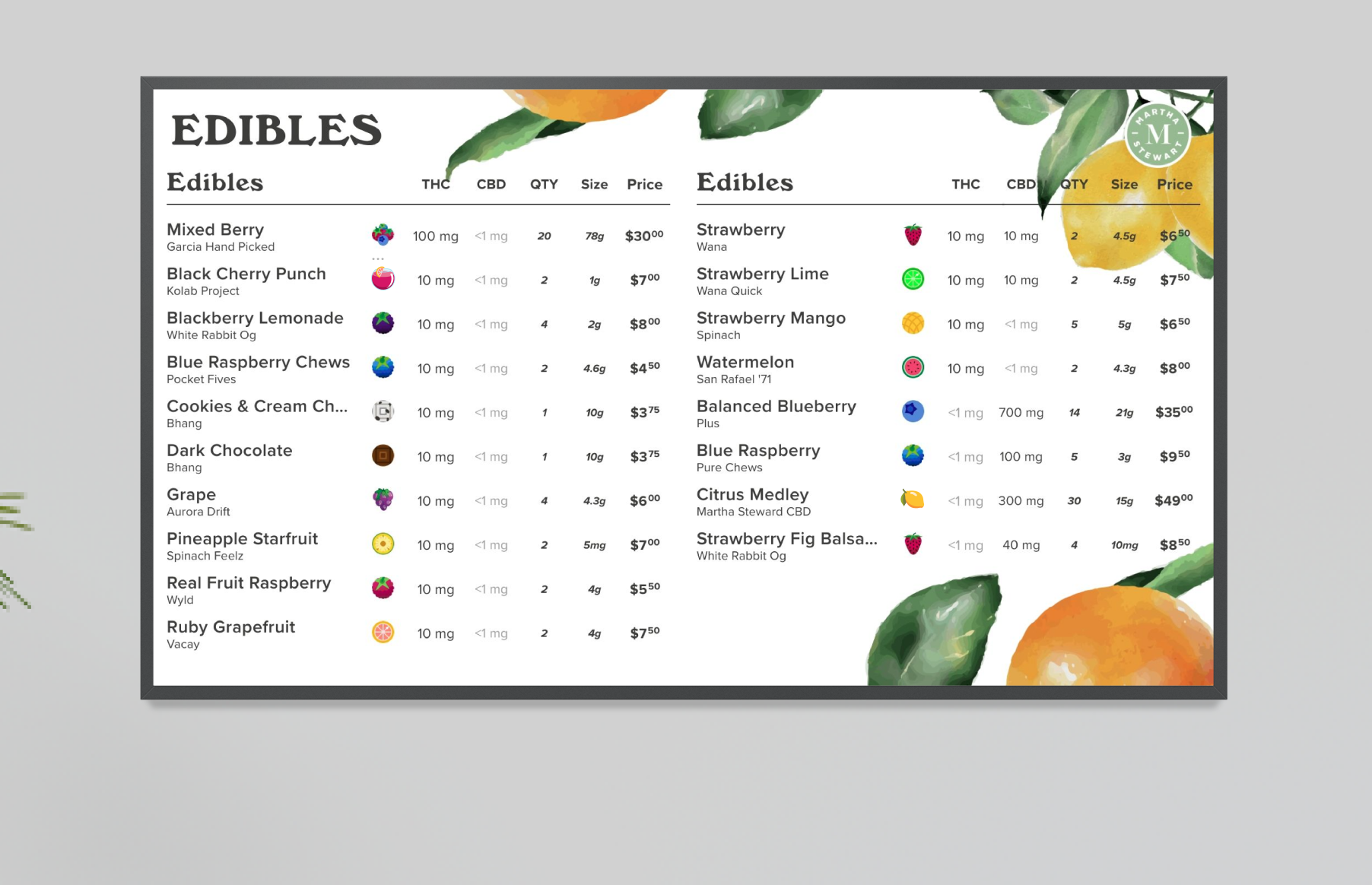
For example, when scanning a landscape menu with two columns of cannabis products, cannabis customers tend to spend the most time looking at the first and last items on the menu—for that reason, we sorted the menu in the “NEW DROPS” section to display the cannabis products in a ‘Price - descending’ order and in the “EDIBLES” menu section we display the cannabis products in a ‘Price - ascending’ order.
Grab your cannabis shoppers’ attention right from the bat with the Foggy theme landscape menu.
3. Emphasize certain cannabis products on your dispensary menu
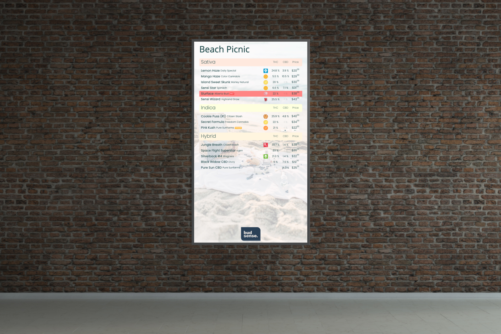
Like how newspapers and magazines use “call-out” quotes to emphasize certain bits of information, you can color highlight or add style, such as bolding, italics, underlining and adding text color, to certain cannabis products you want your cannabis customers to buy. By highlighting these products on your dispensary menu, you can direct your cannabis customer’s attention to that item, making it an “eye magnet” on your dispensary menu.
On this menu, we put emphasis on the ‘Slurface’ flower by highlighting it in red and pairing it with a SALE label.
4. Use color to influence your customers’ feelings
Not only can color be used for product emphasis on your dispensary menu, but it can also be used to influence your customer’s feelings. This is because people, often subconsciously, respond emotionally to color. In marketing and branding, color impacts consumers’ impressions of a brand or products on a menu.
To name a few ways you can add color to your BudSense menus, you to change the font colour, heading color, menu background color, menu section color, and label color.
This edible menu uses red to increase appetite and entice your cannabis customers.
5. Use images to your advantage
In Canada, under regulations, you can’t show open cannabis products to your customers in your store. This means you have to look for other ways to visually connect the product to your customers to communicate its value.
Using images on your cannabis menus is a great way to not only show visually what your cannabis products look like, but also capture the attention of your customers. In the restaurant industry, menus that show items paired with a photo next to them boost sales by an average of 30%.
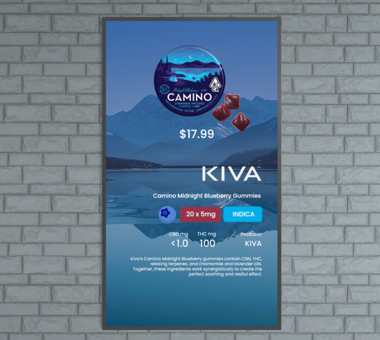
You’ll want to use high-quality photos or appealing photos to best showcase the products on your menu. Here are some highly visual menus we built that leverage product images.
6. Use descriptive language to your advantage
Including product descriptions on your menus are a great way to communicate product information in ways visuals cannot. With BudSense, you have the to ability communicate the value of the category, strain, or product. We often see cannabis product descriptions that include the growing method, where the bud was grown, the consumers consumption experience, the flavors and aromas of the products, the cannabis’ lineage, and its terpenes. Including product descriptions on your dispensary menus can make can a huge difference in improving your customer’s shopping experience.
You can add product descriptions to your Drive Thru Marketing Menus or Feature Product Marketing Menus.
Creative product descriptions make strains sound more intriguing and appealing. Get your customer excited about your cannabis products with the Feature Product Marketing Menus.
7. Use Labels to communicate the value of a product
In the restaurant industry, comparing products labelled with sensory descriptors such as “tender,” “succulent,” and “satin”; cultural/geographic terms like “Cajun” and “Italian”; and nostalgic terms like “homestyle,” “traditional,” and “Grandma’s” versus the same meals without those extra descriptors revealed an important insight: the descriptive labels increased sales by 27%.
The same goes in the cannabis industry, you can add Labels to products that highlight your cannabis products’ value. In BudSense you have the ability to add Labels to your products such as; Staff Picks, High THC, Low Sock, Infused, Restocked, New, Sale, etc. You also have the ability to create your own custom labels to add to your products.
Share with your cannabis customers your store’s best sellers with a BEST SELLER Label.
8. Use Badges to visually communicate product information
Badges have the ability to communicate a product’s flavours, aromas, effects, extraction methods, and product information such as terpenes, cannabinoids, and plant types. You also have the ability to add custom badges to your products.
Both Badges and Labels can be used as visual shortcuts for your customers to absorb product information.
Share with your cannabis customers your Flower’s flavours with BudSense’s ‘Flavor’ Badges.
9. Showcase the prices so they appeal to your customers
According to BMC, the price of cannabis products appeared to be the most important factor that influences a cannabis customer’s purchasing decisions. Other factors include the product, quality, packaging, social influences, and retailer characteristics. The heavy weight price has on influencing customer purchasing decisions is why we built out menu software to emphasize the price column.
With BudSense’s menu software, you can use dynamic columns and styling, such as bold, italic, strikethrough, underline and highlighting to put emphasis on the price column on your dispensary menus.
In addition to putting emphasis on the sales price column on your cannabis menus, you can also use add a secondary pricing column on your dispensary menu. With BudSense you have the ability to use a secondary pricing column to show the added taxes on each item, your competitor’s pricing, unit pricing and bulk purchasing. By doing this you can use prices as a major selling point.
Your goal is to create a menu that is easy to comprehend and absorb information so your customers can easily make informed decisions and you can influence their purchasing decision to sell more weed.
We hope you found our blog on tips for designing a successful cannabis dispensary menu and are inspired to use the flexibility BudSense offers to create an optimal customer experience to make selling weed easy. Book a demo today to learn more about how BudSense can enhance your cannabis shop!
