The ‘Sweet Spot’ on a Cannabis Menu
Design your dispensary menus to maximize profits in your cannabis store
Merchandising and psychology go hand in hand when influencing your cannabis customers’ thoughts and actions to spend more money.
This means the design of your dispensary menus has the ability to guide and persuade your cannabis customers to buy certain products.
Call it what you will—subliminal messaging, the power of suggestion, consumer manipulation—but as a cannabis retailer, you are constantly looking for opportunities to support and impact your cannabis customer’s decision-making.
As your weed-selling companion, we thought we’d dive into one menu design hack we learned that influences your customer psychology when purchasing cannabis.
By using this menu hack, we hope to make selling weed easy for you so you can maximize your cannabis dispensaries’ profits.
The menu’s ‘sweet spot’
Rather than reading menus word for word, from top to bottom, customers tend to scan the products quickly. Their eyes take shortcuts and focus on certain zones on the menu.
This means the design of your menus needs to have a strategic layout. You want to use that small amount of time effectively as it has a large impact on customers purchasing decisions.
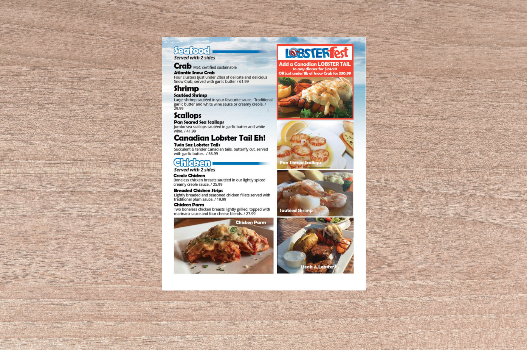
When analyzing menu engineering in the restaurant industry, for years, restaurants have been designing their menus under the assumption that customers’ eyes are naturally drawn to the upper right-hand corner. They have been placing their higher profit items in this spot. However, new research suggests that when customers scan a menu, their eyes tend to gravitate first toward the upper left-hand corner of a menu, similar to how you would read a book. This spot on the menu is known as the menu’s “sweet spot” or the “prime real estate.” This spot is where restaurants often place the product they want to sell the most, usually their highest margin items, dead stock items or what they have the highest quantity of.
When scanning a portrait Flower menu, your cannabis customers will spend the most time looking at the first and last items on the menu—for that reason, we sorted the menu in the “Flower” section to display the cannabis products in a ‘Price - descending’ order. In the “Half Quarters” menu section we display the cannabis products in a ‘Price - ascending’ order. By strategically adjusting the order of your products, you can capitalize on the cannabis menu’s sweet spots.
The cannabis menu’s ‘sweet spot’
The section ‘sweet spots’ on the menu
The menu's ‘sweet spot’ doesn’t stop at the first and last item on the menu. You can also find ‘sweet spots’ within each menu section.
In a study conducted at a Tel Aviv café, researchers changed the order in which items appeared in the categories of appetizer, entrée, soft drinks, and dessert. Items at the beginning or end of each section list increased in popularity by 20 percent.
Here’s an example of a coffee house menu from the specialty eatery industry. In the cafe menu example, there are ‘sweet spots’ found in the signature drinks, classic drinks, coffee and non-coffee sections. Again, the ‘sweet spots’ would be the first and last item on each menu section with signature drinks being the first section that captures the menu readers’ attention.
The sections ‘sweet spot’ on a cannabis menu
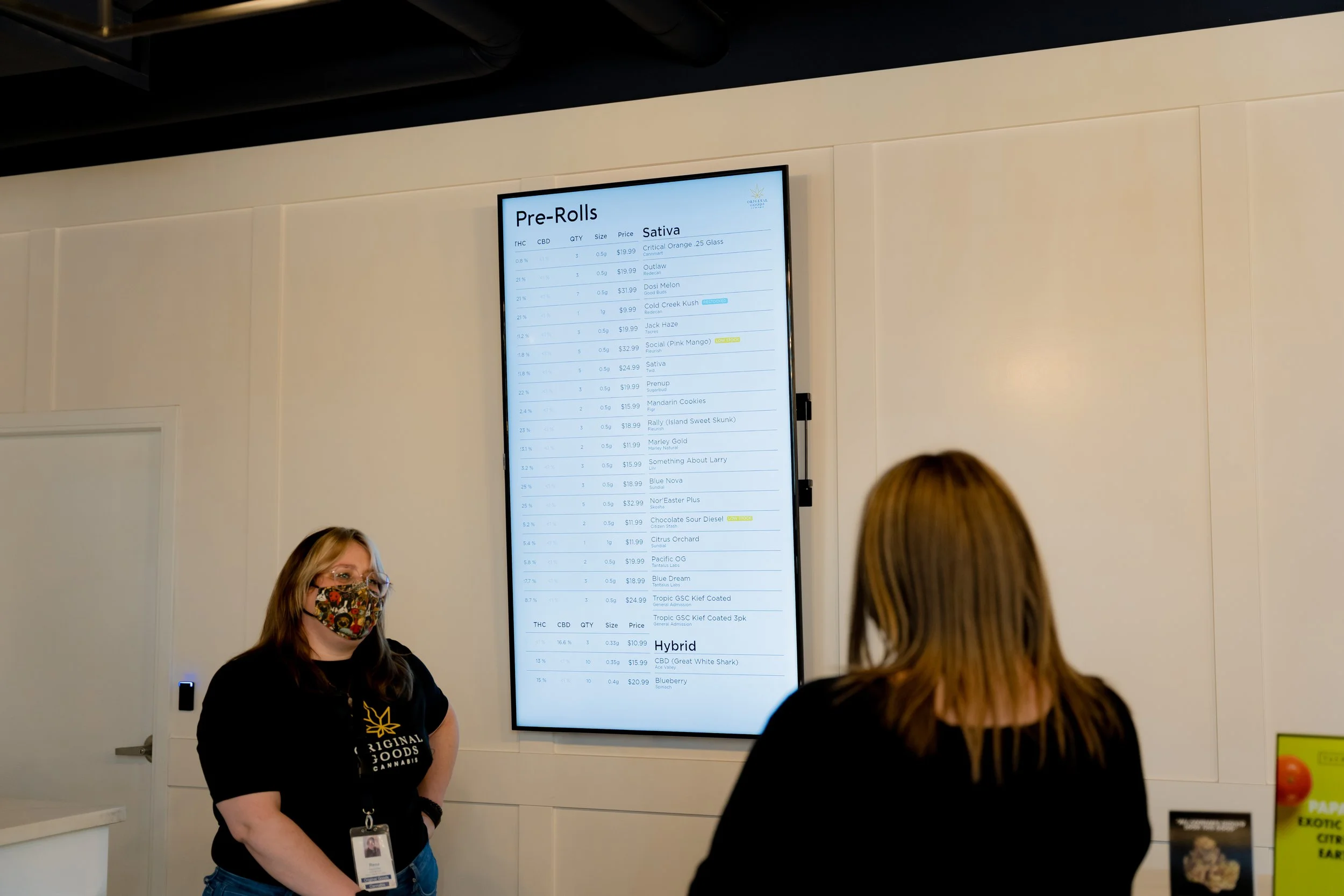
Since there are three different sections on this Pre-Roll menu, we used the ‘Price - descending’ order in the first section for the Indica Pre-Roll products, we used the ‘Price - descending’ order in the second section for the Hybrid Pre-Roll products, and used the ‘Price - ascending’ order in the second section for the Sativa Pre-Roll products.
Since this menu aims to draw the cannabis customers’ attention toward the price, we highlighted the price column with Dynamic Column stylization to make it stand out.
Your goal is to create a menu that is easy to comprehend and absorb information so your customers can easily make informed decisions and you can influence their purchasing decision to sell more weed.
We hope you found our blog on tips for designing a successful cannabis dispensary menu and are inspired to use the flexibility BudSense offers to create an optimal customer experience to make selling weed easy. Book a demo today to learn more about how BudSense can enhance your cannabis shop!


