4 Top Cannabis Retail Tips for Your Dispensary
You’ve decided to open a Cannabis store. You’ve got a location, a brand vision, a POS provider, but what’s next!
What you need to know about preparing your store for Dispensary Menu Boards
Dispensary Layout - Display Size, Location, Quantity, and Orientation
Power and Internet Requirements
POS Integration
The Little Things
What we’ve learned from building cannabis retail stores.
Starting a cannabis retail company can be a daunting task.
First there’s all the regulations of getting a permit. Then you need to find a location. Then you need to work with all the services that seem to be convinced you’re running an illegal business and are committed to charging you the “Cannabis Tax” like banking, insurance, and payment processing.
Once you’re done all that paper pushing it’s time to think about product, customer experience, and branding. No wait.. what about employees and standard operating procedures? And margins? And operating hours? And how people are going to find us on Google?!
Ok. We can stop. It’s clear there isn’t a simple list. It’s quickly apparent that there are a million things to do - how do you find the time?
An easy way to simplify is by getting the help of people who have been there before.
Our BudSense our team has been personally involved with building and running over 30 Cannabis stores along with a growing number of retailers using our software successfully.
But wait, don’t sign up just yet, let us prove our expertise first before you just blindly trust us at face value. At the end of this blog if you like what you’ve read -- even a little bit -- you’ll find a link to book a demo of our platform. On this Demo call we want to hear about YOU and YOUR business. We can then apply BudSense’s solutions to YOUR unique vision.
Now let’s get into the basics of what you need to prep your store for the most effective use of digital dispensary menu boards.
Last minute decor before opening day - It’s all part of the process
Dispensary Layout - Location, Quantity, Display Size, and Orientation
This is the most important pre-planning step for a cannabis store looking to utilize digital menu boards. Once you have a general idea of the in-store experience you’re looking for you can get to work on finalizing the details.
Here are some questions to ask yourself during this process.
How do you want your customers to flow through the store?
Take your floor plan and think through your desired customer experience from a high level. There are several different options here that can all work. The important notion is to define your goal and vision. An undefined vision will complicate store operations down the line and cost you stress and money.
A couple example suggestions of layouts are- ‘Quick Food Service’ or ‘Loop’. There are several other ways to create a successful cannabis store, but most are a combination of these two concepts:
The ‘Quick Food Service’ model is effective for several reasons- customers are familiar with the idea and it’s an efficient use of space, think McDonalds or Chipotle.
Drawing of the sales floor of a retail cannabis store using the familiar “Quick Food Service” model
One of our favorite retail behavior facts is that the majority of people turn right when they have a turning decision- like a front door. It’s called an ‘Invariant Right’. Use this idea when designing your desired customer flow into your shop.
Customers line up, wait for their turn, and actively look at the highly visible menu while they wait. For this model to work you need to make sure you have adequate menu real-estate behind the counter with big enough text to read from 10 to 12 feet away.
Bridlewood Cannabis built their business on efficiency, product selection, and customer service. Layout based loosely on the ‘Quick Food Service’ model.
The ‘loop’ model is exactly how it sounds, your customers have an outer loop to move around with inner and outer merchandising displays. Menus can be dispersed in the middle or on the edges of this design. Liquor stores are essentially a scaled up version of this model with multiple shelves acting as the central display.
An example of a ‘Loop’ model cannabis store. This store is a future Canna Cabana, built by our friends at Innova Developments
When choosing this model be mindful of how many staff you will need to create the desired customer experience. Often times we see retailers over-build their stores, leaving them with the difficult choice of maintaining a bloated payroll or sacrificing customer experience.
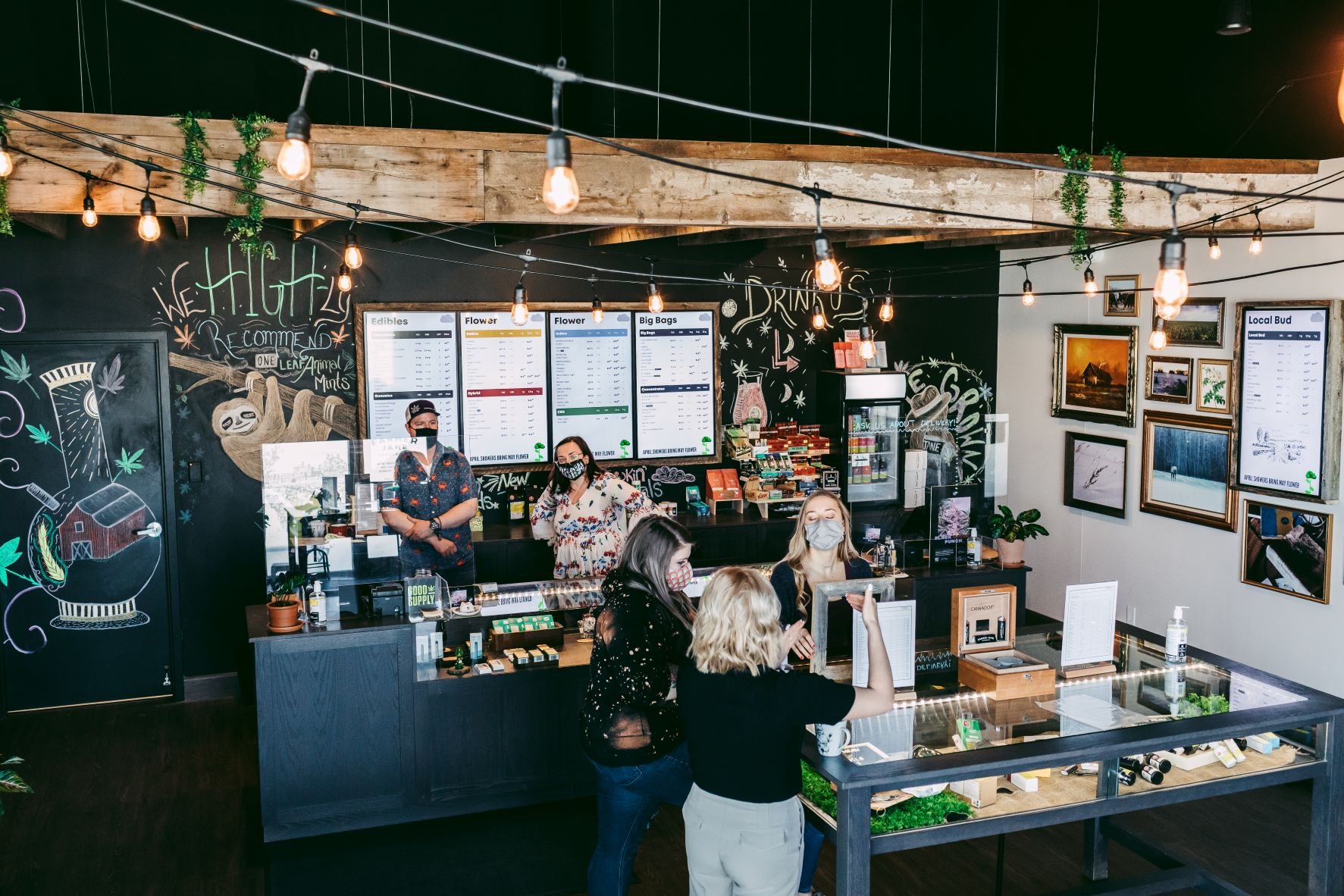
Farmer Jane Cannabis is another good example for what to think about when building out your floor plan. Their design combines elements from the loop model and the quick food service model. You can read more about Farmer Jane’s approach to merchandising with BudSense here.
Do you want to display product information in a central location or dispersed throughout the store?
This question has a similar thought process to the above but the difference here is applying your merchandising strategy to your selected layout. Sometimes this thought process can make you go back and modify the layout to accommodate merchandising needs.
A couple options to consider while deciding where your merchandising is going to live are:
Physical Product Displays
Wall Education and Product Information
Check-out basket builders
When deciding what to merchandise and where, flexibility is your friend. Flexibility is the most important factor to consider. This is because retail recreational cannabis is a brand new and constantly changing industry. Even the most experienced cannabis retailers are trying new things, learning from their mistakes, and adjusting.
With this in mind if you don’t design your retail space to be flexible you’re fighting a losing battle.
Expect to make mistakes, expect to learn, and expect to change.
Digital displays and automated paper menus can be a massive help when creating a dynamic space. They both offer flexible options in their own way. Digital displays through content, and paper menus through content and placement location.
Would you prefer digital menus behind the sales counter, dispersed throughout the store, or a combination of both?
Flexibility is also the key here. We have not met a store owner who hasn’t at least thought about adding an additional TV.
It’s one of those “If I only knew then what I know now” situations.
But here is your chance… get the extra TV!
The combination of digital displays and BudSense solve retail cannabis problems. The more digital displays, the more problems you can solve, it’s that simple.
You won’t regret it, especially when we can help you understand how to monetize that TV (Ask us about this on your demo call if you’re interested).
The big decision in display placement comes back to store layout, there are three main different approaches here for your primary displays all with their pros and cons.
Bank of TVs behind the Counter
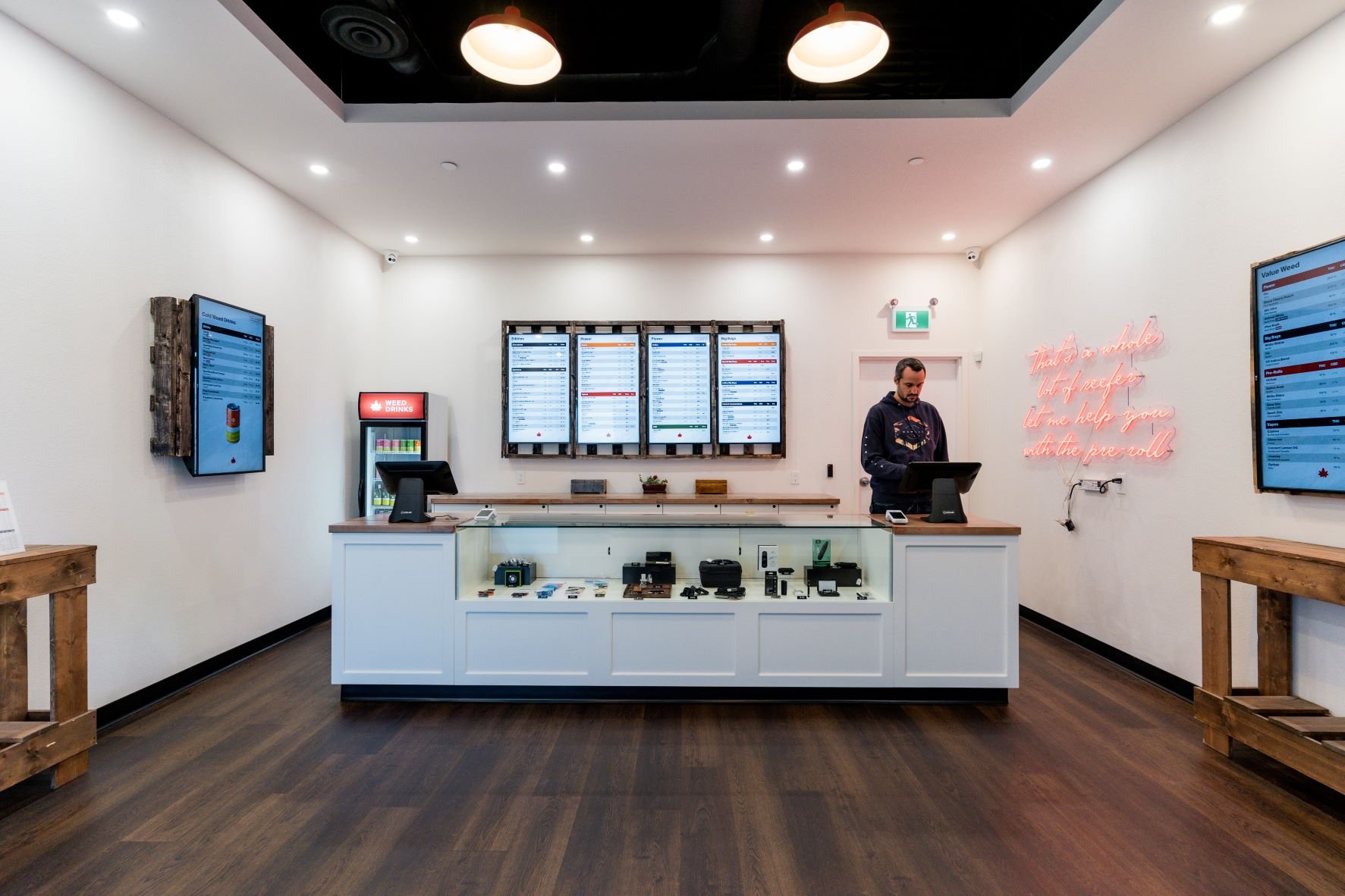
Utilizing a bank of TVs behind the counter is a safe bet. It’s tried and true. If Mcdonalds does it, you know it’s at least an ‘ok’ strategy. The only thing to consider here is to make sure your font size is big enough to read from a distance.
Bank of TVs somewhere on the sales floor
A bank of TVs somewhere on the sales floor works, just make sure that you understand how to tie together the rest of the customer experience. You don’t want sales personal stuck behind the counter and customers forgetting what they wanted on their way to the check out if there is a disconnect in your customer flow.
TVs distributed throughout the store
TV’s distributed throughout the store is another effective means of using digital dispensary menus. This requires less up front planning because you’re creating flexibility - the digital content and menus can always be moved around to down the road.
Now that you’ve gone through this thought exercise, it’s possible to answer our three questions:
Location
Location comes down to a subjective perspective, but at least now you know what’s possible and the why behind it. Select locations based on how you are guiding customers through your ideal customer experience.
Quantity
More than you think! Trust us - we don’t sell TVs and our software can be used on as many TVs as you want with no extra cost. We have never met a retailer who thinks they installed too many digital displays.
Size
42 inches is a healthy entry point. The most common TV usage is a 42 inch portrait TV- it’s a nice combination of size and readability. Anything above 42 inches will also work, just be mindful of how much space you have to work with. A bigger TV doesn’t always mean you can fit more content on it, the resolution is still the same.
42” portrait displays with bard wood frames showcasing a value weed menu and vape cartridges
Orientation - Portrait or Landscape
This is another subjective decision. You will find some people are convinced that portrait is the way to go because of the single uniform product columns. But landscape menus are also useful with two smaller columns- and their familiarity is undeniable for product photos and videos.
All of our themes are always built for portrait and landscape so nothing to worry about for compatibility.
2. Power and Internet Requirements
If you’re leaving these decisions up to a designer, IT, or electrician, make sure to check their work to ensure you have the necessary connections. It will only save you time and money in the long run.
Power and Internet is a lot less subjective than your other decisions. Here you are simply building the electrical and data infrastructure necessary to run your displays and nothing more.
Power
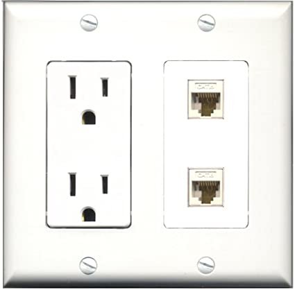
120V receptacle behind your TV. Make sure this is well placed to hide any cables.
Internet
Wifi or Hardwired. Hardwired is always preferred for stability but wifi is an acceptable choice and will work with BudSense hardware.
If you choose to go with wifi, we strongly suggest to put a wifi repeater in your retail area. Trust us - the extra expense is well worth the troubleshooting and inconvenience you may face with poor wifi connectivity.
Internet and Power receptacle to be hidden behind your digital displays
If you’re leaning toward hard wired, all you need is a female cat 5 or cat 6 run to each tv location back to your switch. From here your IT or electrical friend can help you with the rest of the details.
If you don’t have the support you need to make this decision just reach out and ask, we are happy to help.
3. POS Integration
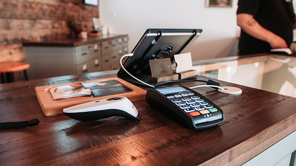
One of the biggest advantages of BudSense is that it connects to your POS system. This saves you from the hours and hours of data entry and the potential of human error that comes from a non-integrated merchandising solution, DIY spreadsheets or chalkboards.
If you haven’t selected a POS option, take a look at the platforms BudSense already integrates with: Cova, Greenline, Dutchie, and Treez.
If you’ve already selected a POS provider that isn’t on this list, that’s okay, schedule a demo and we can talk about what we need from you to create a new integration that aligns with your software selection and store opening timeline.
4. The Little Things
As you know, everything above is just a fraction of the planning it takes to open a retail cannabis store.
Even though we have done several of these builds, it’s always surprising to go back and look through the details and decisions that come together to create an efficient and profitable cannabis shop.
All of this planning and effort is to create a foundation for the experimentation and fine tuning that takes place after a store is built- the little things that take your cannabis store from good to great.
These little things are what Budsense brings to the table.
Some digital menu companies expect that you settle on version 1 of your digital menus. They likely push back on updates and force you to email them with any change requests.
At Budsense not only do we expect these changes - we encourage them.
This is the why behind suggesting so much flexiblity in the design process. It’s not if - but when and how often you decide to make changes.
We expect this, and encourage it. This is why we created a platform that you access to from anywhere. Where you can create, edit, and rearrange menus in any way you see fit.
If you were to settle on version 1 and not allow for iteration, you’re settling on stagnant revenue and an incomplete customer experience.
BudSense’s tools are built to make merchandising easier. Giving you better results with less effort.
We can’t wait to fill you in on all the little ways you can improve your business by utilizing the flexible digital real-estate of your now perfectly positioned displays.
Wondering How to get started?
Great Question! Book a demo today to learn more about how BudSense can help your dispensary!
If you’re curious about pricing, check it out on our pricing page. But don’t be a stranger, we are flexible in our offering. Make sure to reach out to us and help us understand your specific needs. We’re here to help.


