Why Edible Customers Love Visual Flavors on Dispensary Menus
Casual Edible Consumers Crave Familiar Experiences
Meet Stephanie, a casual cannabis consumer who knows exactly what she wants from her shopping experience. Visiting the dispensary about 1 to 2 times a month, she typically spends around $25 per visit. Stephanie is a fan of edibles and often makes her selections based on flavor.
Stephanie’s shopping style is all about efficiency, with her typical dispensary visit lasting around 5 minutes. She’s not interested in exploring new products; instead, she gravitates towards the tried-and-true items she knows and loves. This predictability in her shopping behavior suggests she values reliability and familiarity in her cannabis products.
For Stephanie, an ideal dispensary experience is streamlined and user-friendly. She wishes menus did a better job of highlighting sales, promotions, and, most importantly, flavors. As someone who shops by flavor, Stephanie finds it frustrating when she has to dig through menus to find the best deals or her favorite options. She appreciates when a store makes it easy for her to find what she wants quickly, without the hassle of sifting through irrelevant options.
The Power of Flavor-Driven Visuals
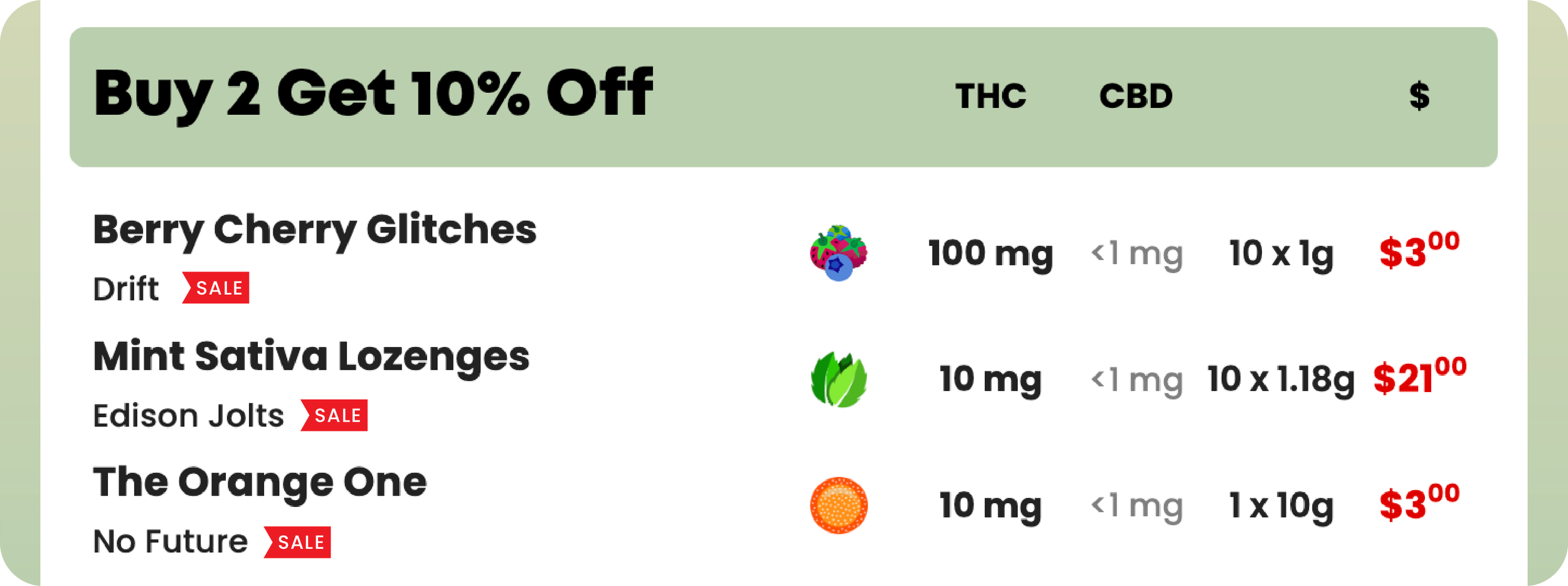
A smart dispensary recognizes that flavor is a primary driver for many edible customers like Stephanie. By incorporating visual cues, such as small fruit emojis or icons representing different flavors, the menu can become more intuitive and appealing. These simple visuals not only make the menu more engaging but also help customers like Stephanie make confident purchasing decisions without second-guessing.
Imagine Stephanie scanning a menu and instantly spotting a strawberry emoji next to her favorite gummy. The visual confirmation that she's choosing a product with a flavor she loves makes her shopping experience smoother and more satisfying. This small enhancement in menu design could significantly improve her overall experience, making her more likely to return.
Menus and Merchandising Strategies
Menus can play a crucial role in guiding Stephanie's shopping experience. By featuring clear, visual representations of flavor profiles—whether it's through icons, badges, or color coding—a dispensary can make flavor-driven shopping easier and more enjoyable. Additionally, highlighting sale items with similar visual cues can further simplify her decision-making process.
Incorporating these strategies into both digital and print menus not only helps customers like Stephanie find what they’re looking for faster but also enhances their confidence in their choices. This simple yet effective approach to menu design can lead to increased customer satisfaction and loyalty.
How do I learn more about BudSense?
Great Question! Book a demo today to learn more about how BudSense can enhance your cannabis dispensary!


Henry shops for cannabis based on aroma and flavour, seeking out products with fruity terpenes like limonene and myrcene. For him, the right scent is the deciding factor in every purchase. As more consumers prioritize sensory experiences, dispensaries can cater to this shift by highlighting terpenes and customizing their menus to match customer preferences.
Is your dispensary ready to help Henry find his favourite flavours?